DBKL Has Released A Video Justifying The New KL Logo. The Problem Is It's Even Worse
While DBKL has taken down the video, it's been re-uploaded by someone else. Scroll to the bottom of this story to watch the removed video.
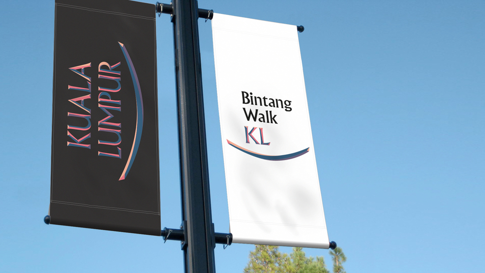
The KL city's new tourism logo — as soon as it was launched — earned the distinction of being the most hated logo on the Internet. The fact that DBKL paid RM15K for it didn't help their cause either.
As netizens on social media platforms not only expressed their disappointment with the branding, they also revealed that the whole logo was actually a free preset.
With the amount of backlash DBKL received from Malaysians, their next step should have been to acknowledge what went wrong
But it seems DBKL missed the memo that Malaysians aren't very fond of the logo.
So instead, what they have done is that DBKL released a video "explaining" the concept, the process and the whole idea behind the new KL tourism logo.
The video, worse than the logo itself, shows metal or tin slabs slowly being chipped away to reveal the words "Kuala Lumpur" and the rest of the tagline, with dramatic music and extremely tacky special effects. Here, watch for yourself:
UPDATE 2PM: The Visit KL Official YouTube channel has taken down the video.
In fact, the video is so bad that at the time of writing this, it had already drawn way more Dislikes (682) than Likes (11), summing up how this writer and everyone who saw the video feels about it:
However, in the description box of the video, DBKL says the logo, made using the specific typeface which was chosen for its similarity to Arabic script, communicates Kuala Lumpur's "Islamic roots"
"This is what makes KL distinctive and on the basis that the city’s identity was built on its history, people, and traditions in the arts and culture. The typeface choice for the positioning is simply to link the city back to her Islamic heritage. The typeface is has (sic) an Islamic scripture character with a modern twist," reads the description further.
In my humble opinion, though, the video is at best a cop-out response by DBKL to the controversy surrounding the new logo's design and at worst a blatant disregard towards what KLites feel about something so vital that they are being forced to embrace
Additionally, I feel there wasn't a video to begin with. That it was made only after social media reacted so negatively to the logo released by DBKL with an attempt to either pacify or justify that how — contrary to the claims that it was done without any proper thought process — there was a process involved that went behind it.
However, the video with its tacky "special effects" hardly succeeds in convincing so.
Maybe DBKL should either approach Zana Fauzi of Stampede to learn and understand how to create a successful city branding...
In a blog titled "Keeping It Real: On KL City Logo & City Branding", the Culture Manager of the local digital creative agency shows this by giving proper examples of how Paris, NYC, and Austin have created their brand by projecting the unique stories and characteristics of their cities respectively.
...of better yet, simply consult Yung Tyng Lee, a Malaysian designer, who has actually created a logo that does show the soul of KL
Did you miss out on watching the video before it was taken down? A guy named Tony Seditious was smart enough to rip if off because once uploaded "nothing ever goes missing on the Internet":
This story is the personal opinion of the writer.
You too can submit a story by emailing us at [email protected].


