[PICS/VID] Things About The New Android L That Will Have iPhone Owners Drooling Over It
If you're an avid Android user, your phone's software is about to look a whole lot different in the next few months. Google is billing the redesigned user interface as the key feature in its next major mobile software update, Android L.

By Sadho Ram — 05 Jul 2014, 12:25 PM — Updated over 10 years ago
With Android L, Google is introducing some major aesthetic tweaks as part of its Material Design overhaul
Material Design is a sleek, neat, and colorful new interface that's meant to make the user experience seamless across devices on all screens - whether you're using a smartwatch, phone, or tablet.
 businessinsider.in
In addition to a leaner overall look, Material Design adds a few subtle nuances that make the Android experience seem more interactive and visually pleasing. Google says it studied paper and ink to achieve the shadowed and textured look you'll find in Android L. Below, we list down some of the best visual components Android users have to look forward to.
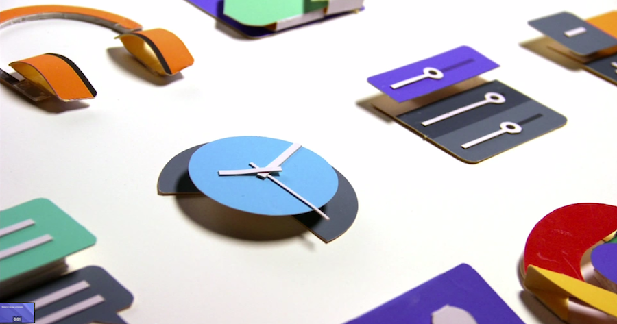
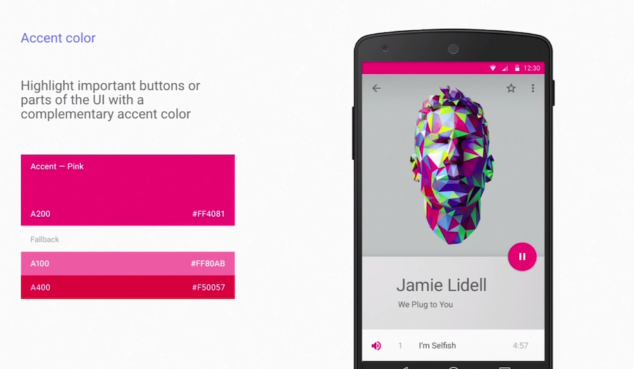
A big part of Material Design is the way colours are portrayed. Google developed a colour palette specifically to highlight shades and tints, which adds more life to UI elements.
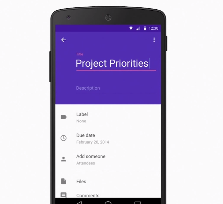
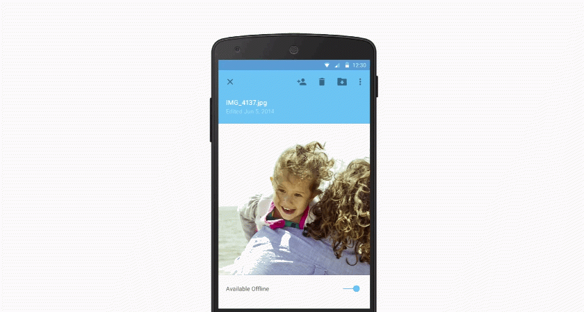
Notice how the generic form above is highlighted in purple and looks slightly larger than the rest. That effect is meant to draw your eye to information that's more important, such as the title in this case.
App icons in Android L are based on geometric shapes, which make them pop and appear more symmetrical
Material Design is based on the same design principles as paper. This means app icons are designed to rise up when you tap them rather than sink down.
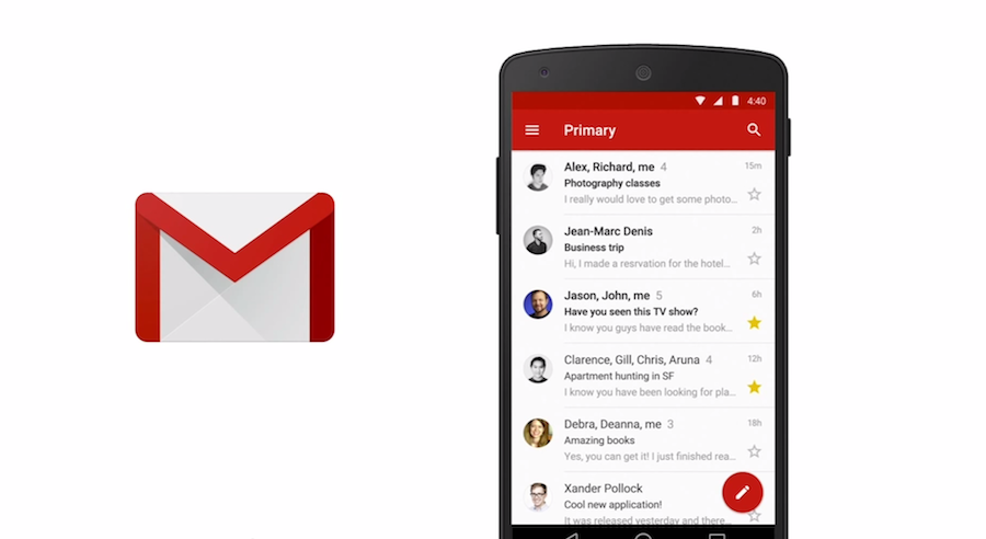
Take a look at how that Compose button in the Gmail app pops out. That floating action button is going to make a big appearance in apps throughout Android L.
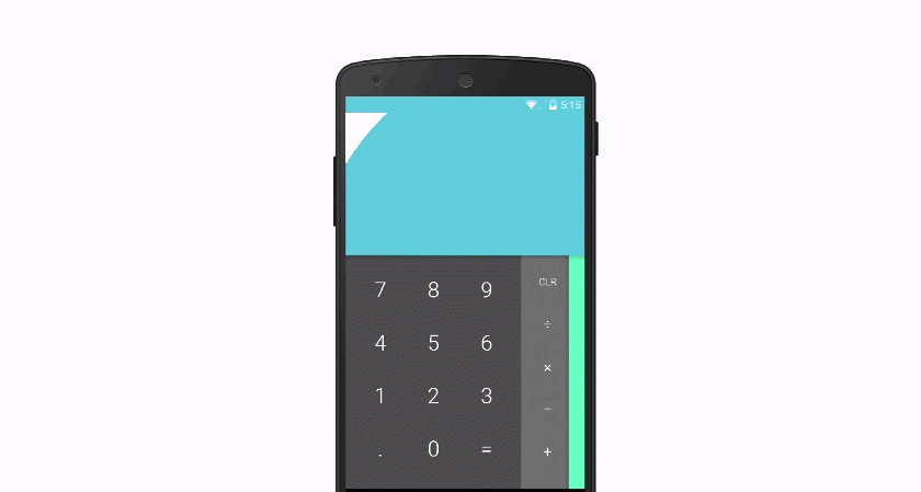
Native apps in Android L will show small animations as you touch the screen. For example, the calculator app shown below.
Also, transitions are expected to be really smooth in Android L. Google compares it to sliding a sheet of paper across a table.
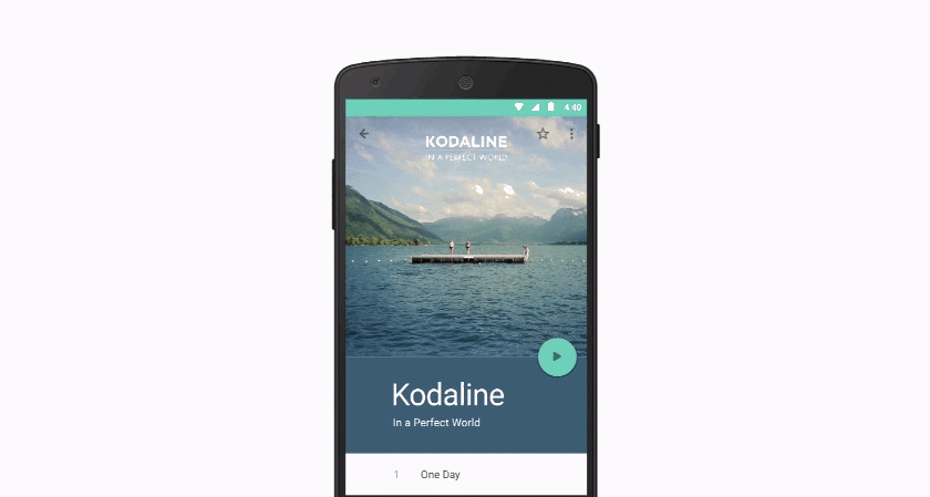
The colours and animations in Android L are designed to draw your eyes toward what's important. In this music player example, the media playback buttons are emphasized.
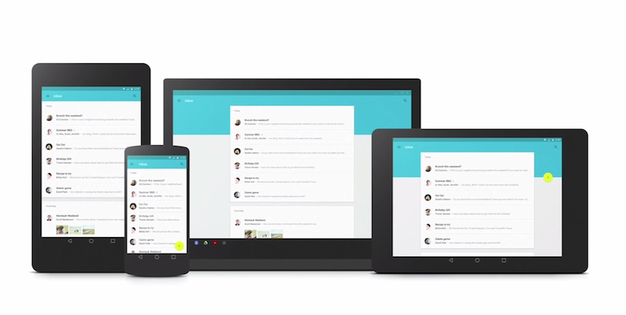
Google wants to make its interface look the same across all devices. The same design language and app icon style across desktop and mobile.
Google is making it easier for developers to add vibrant colours with higher contrast to their apps. So expect to see bolder and brighter colours throughout Android L.
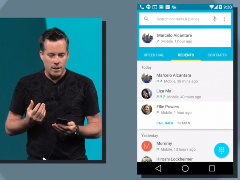
The new Nested Scrolling feature in Android L allows recent calls to fade away as you scroll within the Contacts app. Menu bars lock into place naturally.