[LEAKED] Samsung's New UI Is Unlike Anything The World Has Seen Before
Samsung's interface aesthetic seems to morph with every iteration of its flagship Galaxy, and if a set of leaked screenshots are to be believed, the upcoming Galaxy S5 is to be of no exception.
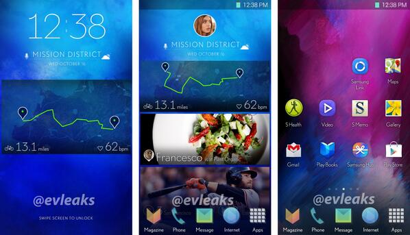
Renowned leaker @evleaks has tweeted trio of these images depicting a whole new Samsung user interface
@evleaks tweeted the images saying, 'Samsung exploring new smartphone UI.'
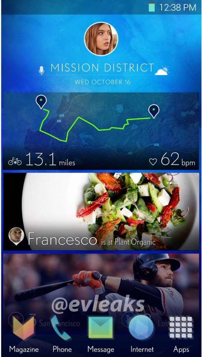
The interface swaps out the current font for a lightweight alternative, and removes drop shadows from beneath all the type
Plain text is also used for the "swipe screen to unlock" prompt, eschewing visual cues. It looks a lot like the Magazine UI featured in Samsung's new Pro line of tablets, albeit scaled down to a smaller display.
All of the icons are changed from its "Nature UX" as well, with the bold and bright colors of old replaced by pastel hues and color gradients
Only the Google applications like Gmail and Play Books look familiar. There's also hint of an HTC Blinkfeed-like stream that pulls in information from various sources like apps, social media, and news sites.
This is, of course, just a purported leak, and no guarantee that Samsung will ship a product with this or a similar-looking interface
@evleaks has a good record for accuracy, but only says the Korean company is currently "exploring" new interface options for its smartphones, implying the UI revealed by the leak is by no means final.
That said, it shows that Samsung is at least considering a fairly drastic departure from the aesthetic in its current interface.


