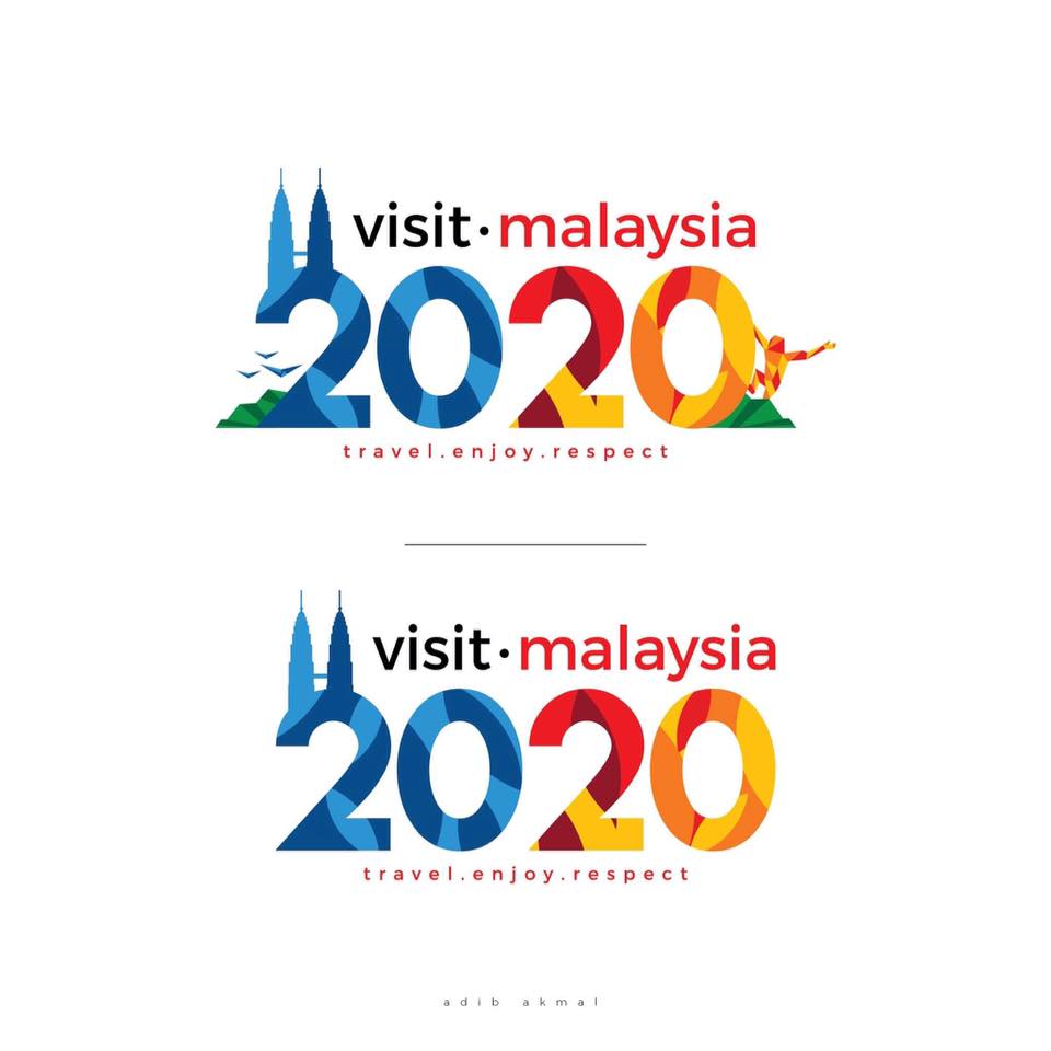
Malaysians Redesigned The Visit Malaysia 2020 Logo And TBH These Look So Much Better
Whatever the ministry can do, netizens can do it better.
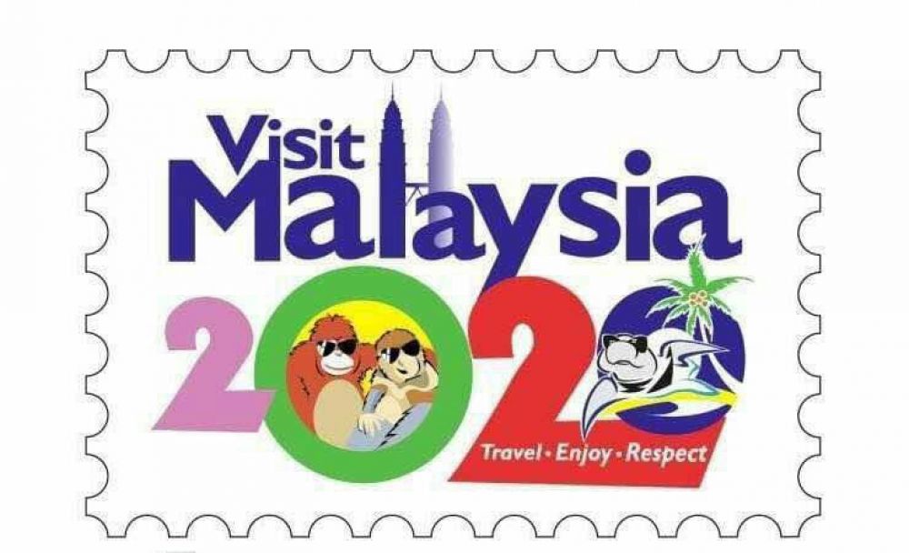
ICYMI: This is the official 'Visit Malaysia 2020' logo
The logo was launched by Tourism and Culture Minister Nazri Aziz at the Asean Tourism Forum (ATF) 2018 in Chiang Mai, Thailand last Friday, 26 January.
The logo has been heavily criticised by netizens on social media.
sometimes i think i'm the ugliest thing on earth then i remember the visit malaysia 2020 logo and i instantly feel better about myself
— rebel cow (@MLSHKR) January 29, 2018
How can they approve such logo for visit Malaysia 2020 campaign is beyond me. It is an insult to all professional graphic designers out there.
— HZ (@hfzmri) January 27, 2018
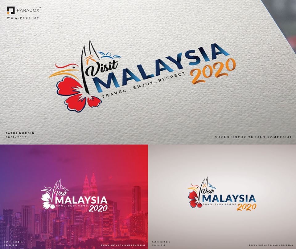
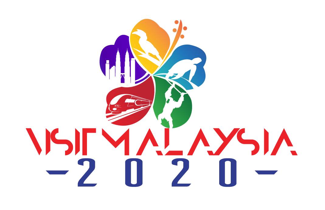
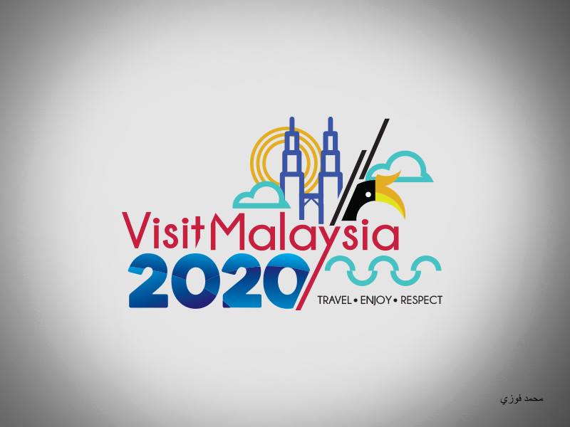
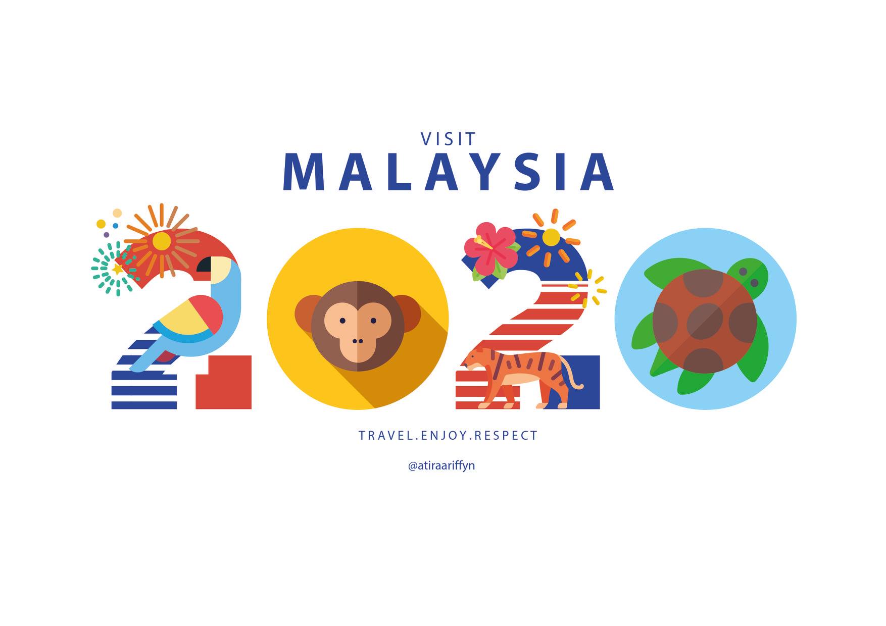
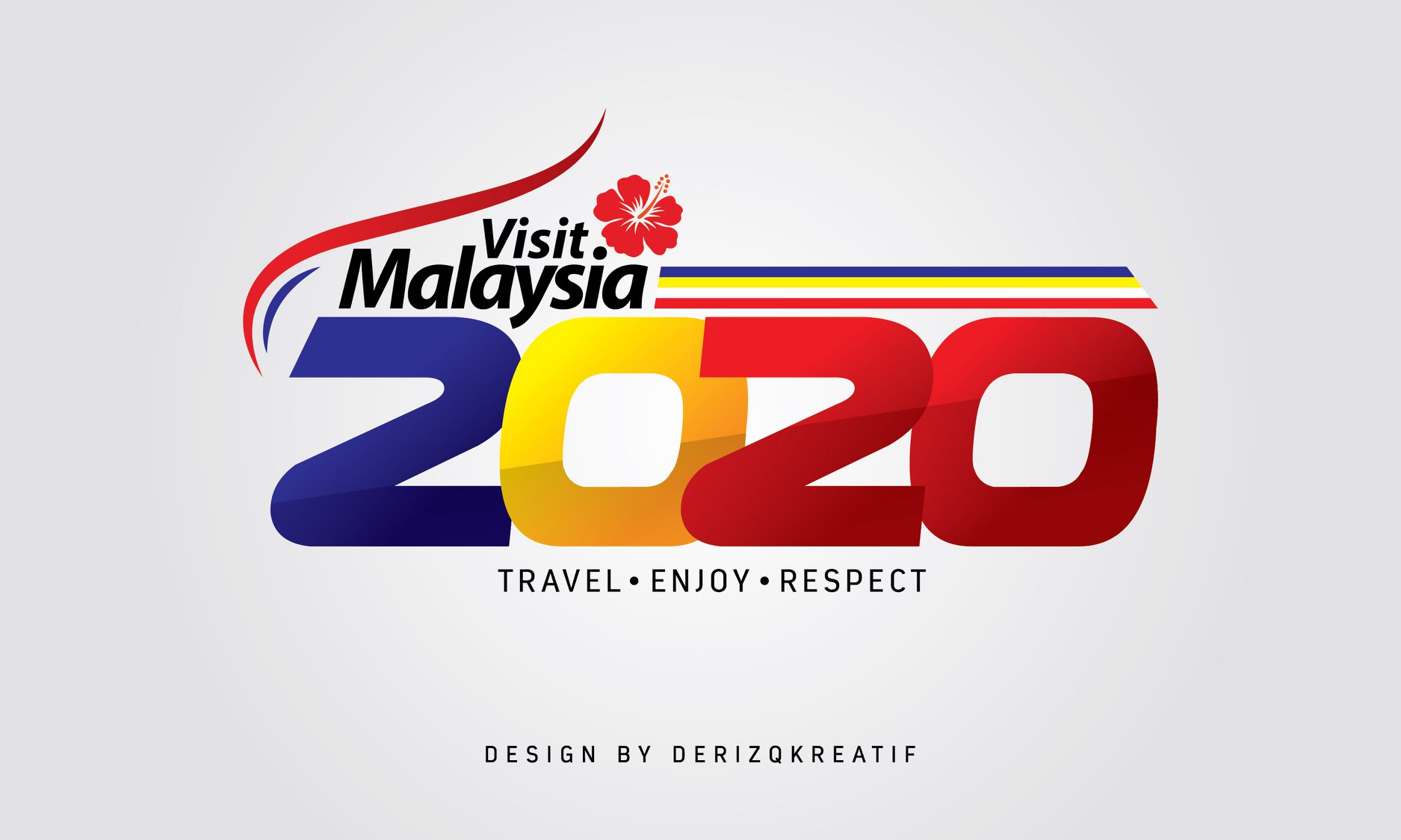
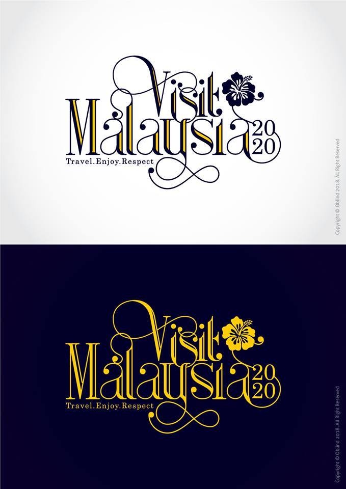
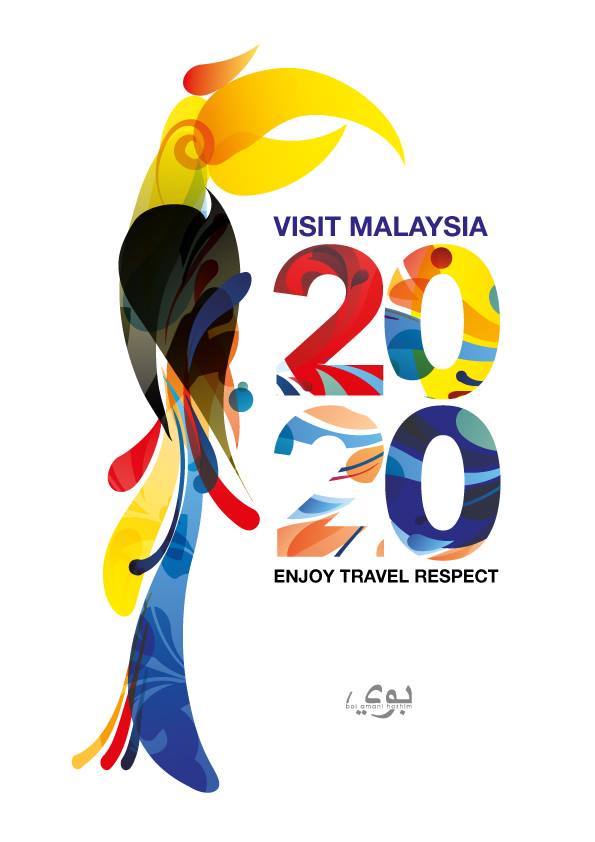
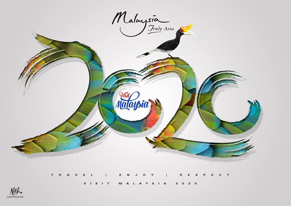
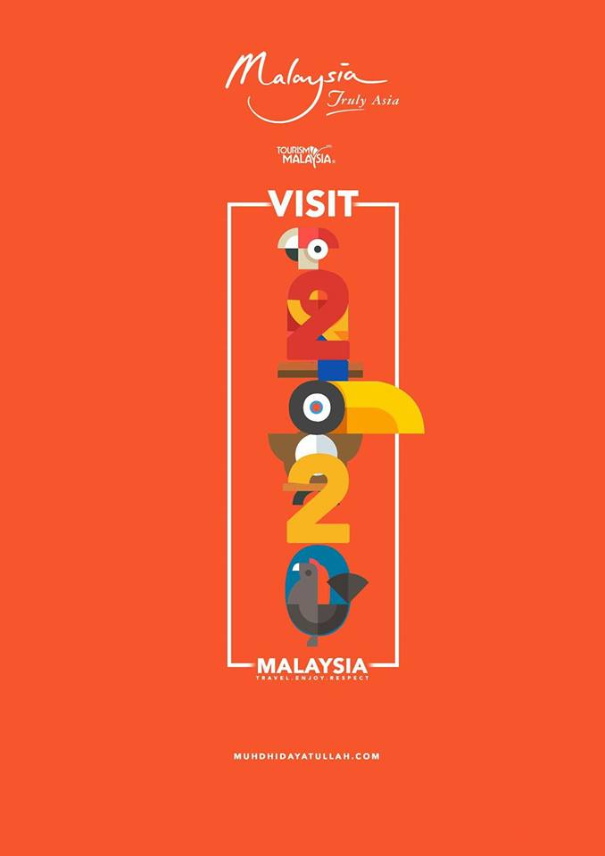
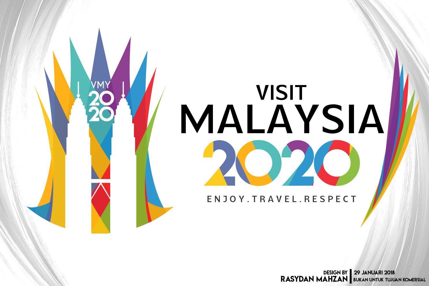
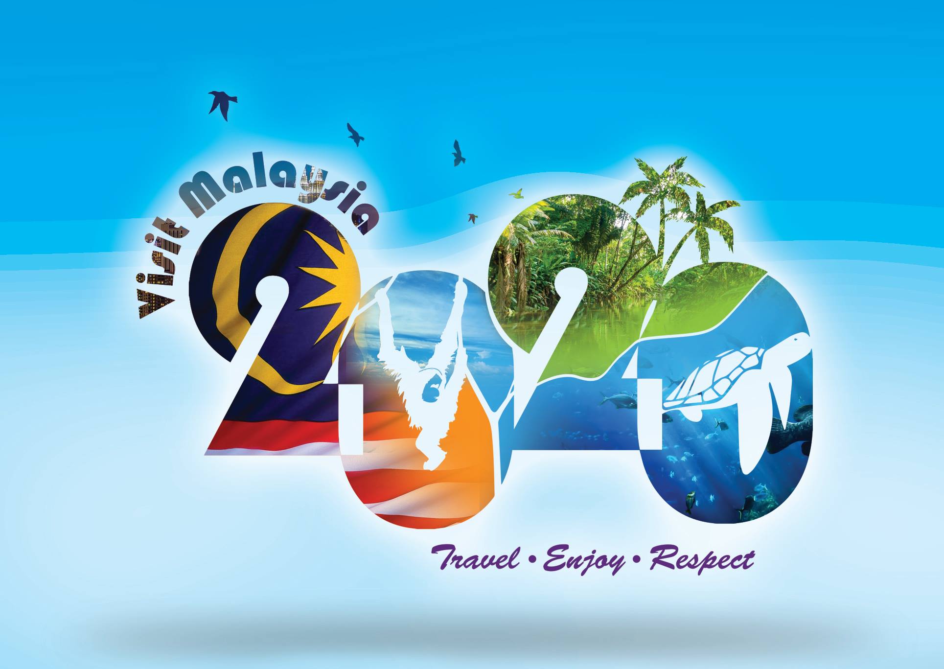
Though the Tourism and Culture Ministry insists that they are standing by the much-derided logo, that didn’t stop netizens from producing their alternative (and better) take of the logo:
The creator said she only took 30-40 minutes to design it, like what?
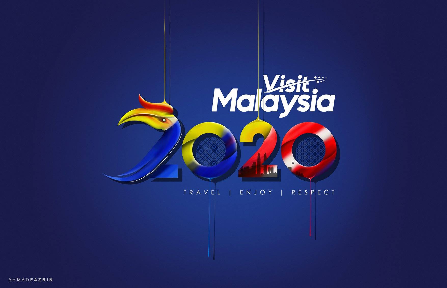
3. Ahmad Fazrin
Just so pleasing to the eye. You can even see KLCC and KL Tower in the last two digits.
Minimalistic, futuristic and traditional are the three concepts the creator tried to capture.
Can you believe that this was done in 30 minutes? What even.
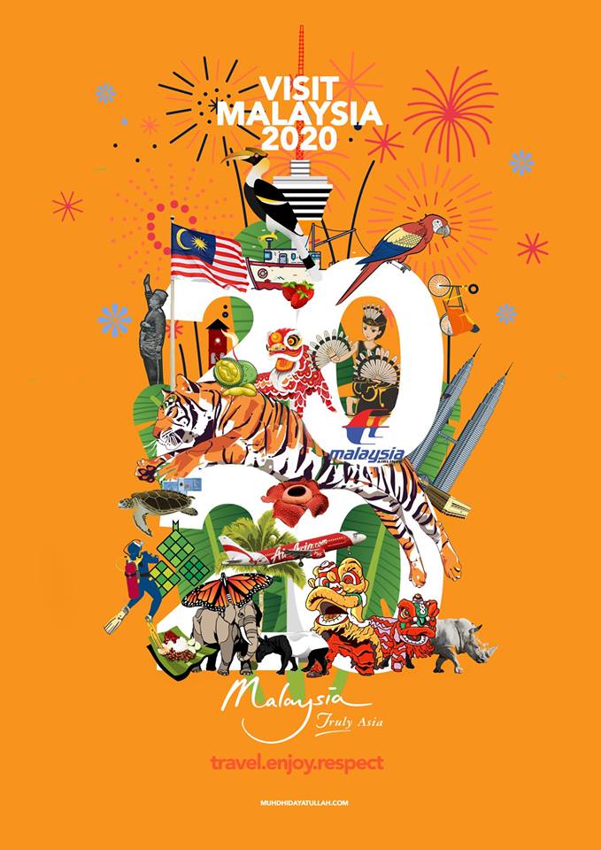
An actual representation of Malaysia in just one poster!

![Image from Muhammad Syafiq Azman]](https://images.says.com/uploads/story_source/source_image/588941/26f9.jpg)
