Google Maps Will Show You Number Of COVID-19 Cases In Your Area
Travel smart and travel safe.

By Lee Yong Jin — 28 Sep 2020, 03:47 PM
Google Maps is rolling out a new feature which shows COVID-19 statistics
The new update adds a map layer which shows areas infected with COVID-19 cases.
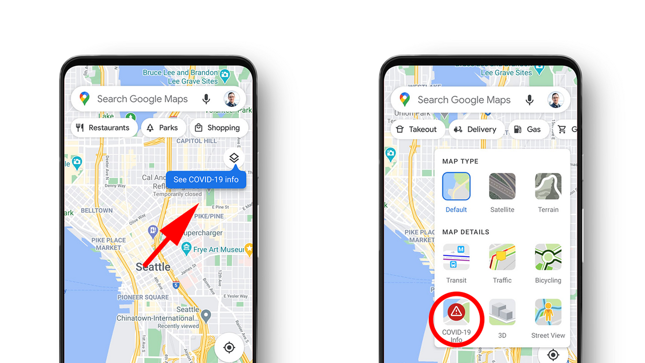
Users can do so by tapping on the layers button on the top right corner of the app and click on 'COVID-19 info'
You'll be shown a seven-day average of new COVID-19 cases per 100,000 people in the area of the map you're looking at.
Maps product manager Sujoy Banerjee said that the tool "shows critical information about COVID-19 cases in an area so you can make more informed decisions about where to go and what to do".
Coronavirus-infected areas are colour-coded by severity
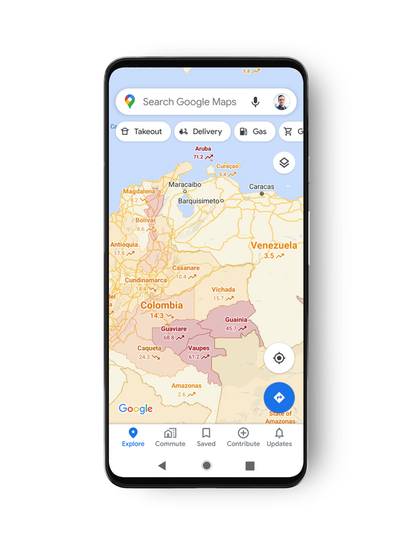
With colours ranging from grey (less than one case) to dark red (more than 40 cases), labels will also show whether the cases are trending up or down.
Trending case data is visible at the country level across the world, though city-level data will vary.
The data used in the layer is taken from multiples sources such as the World Health Organization (WHO) and government health ministries.
The new feature will be available worldwide to both iOS and Android phone users

Pandemic-related features already exist on Google Maps, such as COVID-19 alerts and crowdedness predictions for public transit.
Sujoy hopes that the features will "help you get where you need to be as safely and efficiently as possible."
The update will roll out this week to both iOS and Android users, so keep an eye out for it on your smartphones.
