Here Are 5 Things You Might Like About HUAWEI's EMUI 10
We never asked for a Morandi Palette, but we're glad we got it anyway. :D
HUAWEI rolled out the latest iteration to its operating system with the launch of the all-new HUAWEI Mate 30 Pro
Dubbed EMUI 10, the operating system is based on an open-source version of Android 10 with optimisations designed to work seamlessly with most HUAWEI smartphones.
1. You've got a totally new user-experience, with seamless, multi-screen collaboration
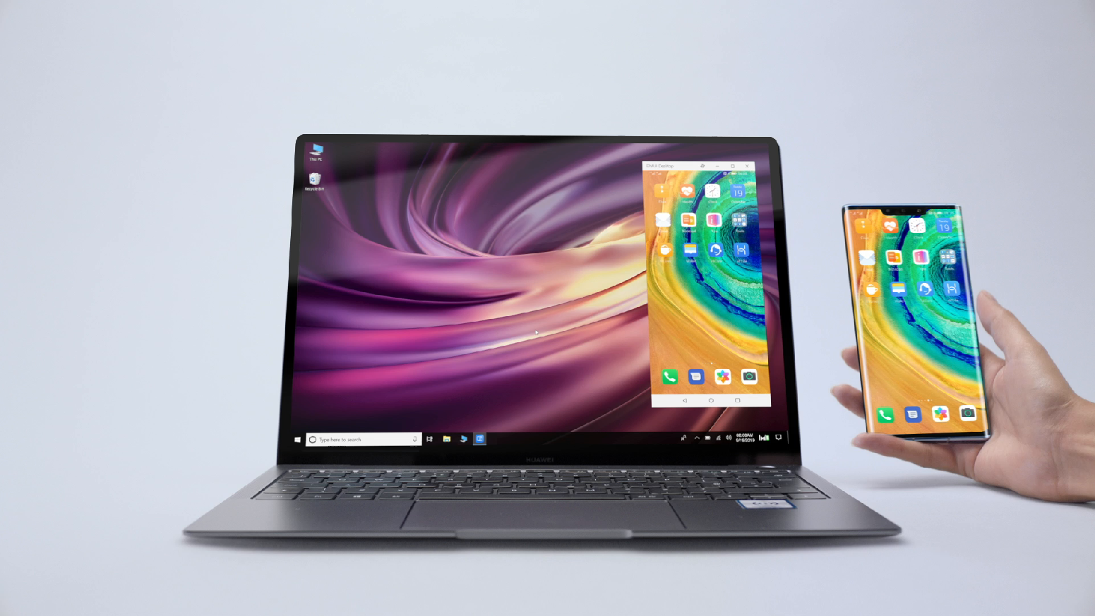
Promising a smoother user experience, EMUI 10 features what the company is calling 'multi-screen collaboration'. It's essentially a type of handover software which allows you to seamlessly connect, say, your HUAWEI Mate 30 Pro with a HUAWEI MateBook 13.
With just a single tap, your smartphone screen will appear on your laptop display. It's like the phone and laptop are one single unit, pretty neat! With seamless drag-and-drop capabilities between either devices, productivity just hit a new high. This is especially useful for multi-taskers!
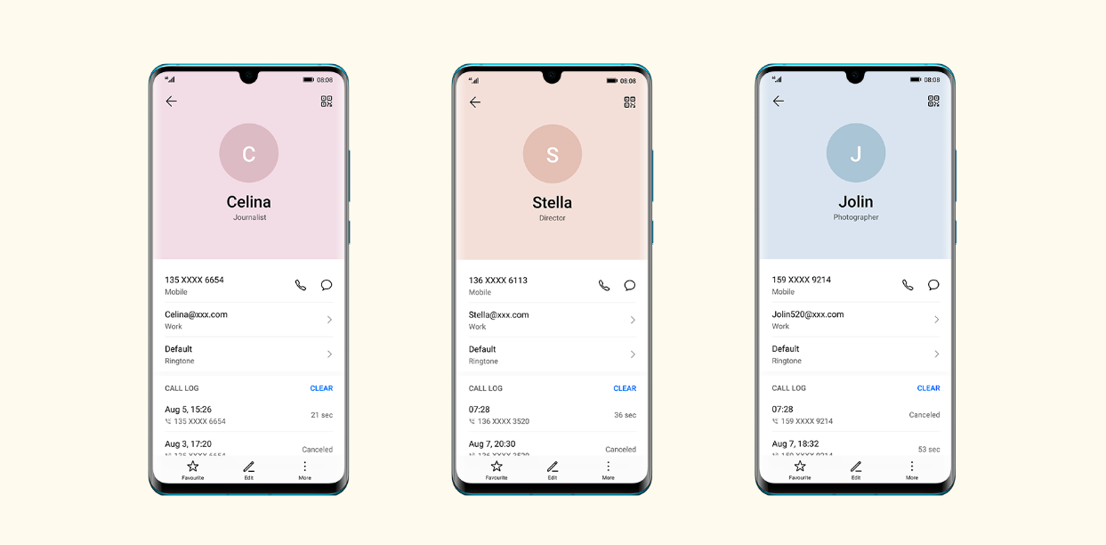
2. The screen pleases your eyes with the Morandi Palette
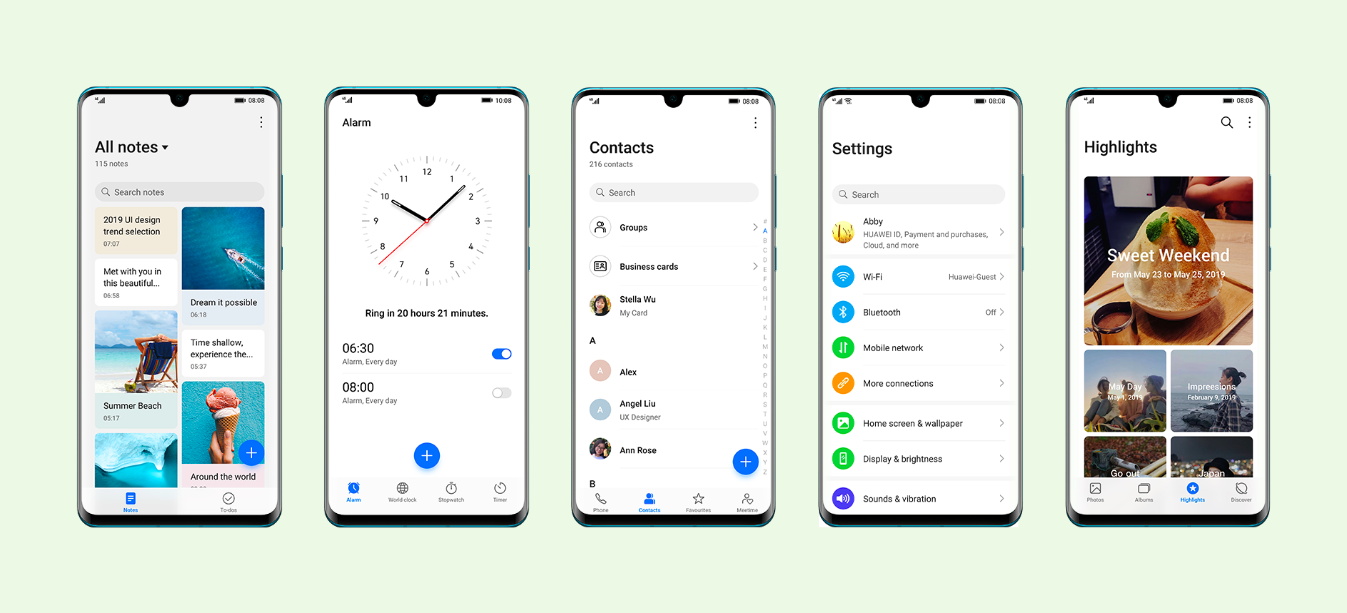
As the name suggests, HUAWEI's use of the Morandi Palette (named after famed artist Giorgio Morandi) is inspired by the painter's signature use of muted, subdued colours to portray elegance and sophistication. Not only does it look cool, it's also more relaxing to look at, especially for extended periods of use.
3. The swiping gestures, transitions, and other on-screen animations are supposed to feel intuitive and natural
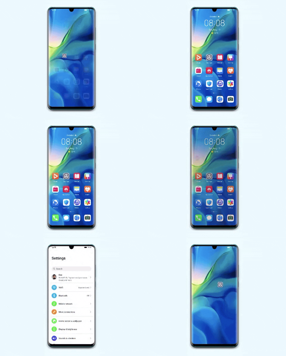
The design of the transitions and other screen animations were inspired by the physical laws of nature. This means that every single movement your fingers make with the screen should feel very natural and intuitive.
For instance, when swiping up from the bottom of the screen, you're immediately brought back to the home screen. Swiping from either the left or right of the screen will bring you to the previous page or app. When making all these gestures, the animations that follow are extremely fluid and insanely smooth.
4. There aren't any trivial designs, just the things that matter
Using a magazine-like layout, EMUI 10 is supposed to help you focus on the things that matter, as opposed to distracting you with menial features. With the heavy use of bigger fonts, as well as grid lines, your eyes are immediately pointed to what matters most.
Similar to the on-screen animations, the magazine layout of EMUI 10 is supposed to feel more natural and intuitive. Nothing about the user-experience should be unpleasant in any way. :D
5. We can all please our dark souls with a built-in DARK MODE!
Perhaps the Morandi Palette isn't exactly your taste. That's okay. Those who've been downloading third-party apps to get 'Dark Mode' on their phones can finally rejoice with the built-in version found in EMUI 10!
With energy consumption and eye health in mind, the 'Dark Mode' in EMUI 10 optimises the battery usage while also providing a relaxing viewing experience, especially in dimly-lit conditions. Reading on your smartphone just got much more pleasant. :)
To purchase your own HUAWEI Mate 30 Pro, MateBook 13, and Watch GT 2, head to HUAWEI's official website
