Nokia Redesigned Its Iconic Logo For The First Time In 45 Years. Here's Why
Hint: the answer is in the image. :P
Nokia, the mobile phone company renowned for pioneering the mobile phone industry before smartphones were invented, recently did a little rebranding with a logo change
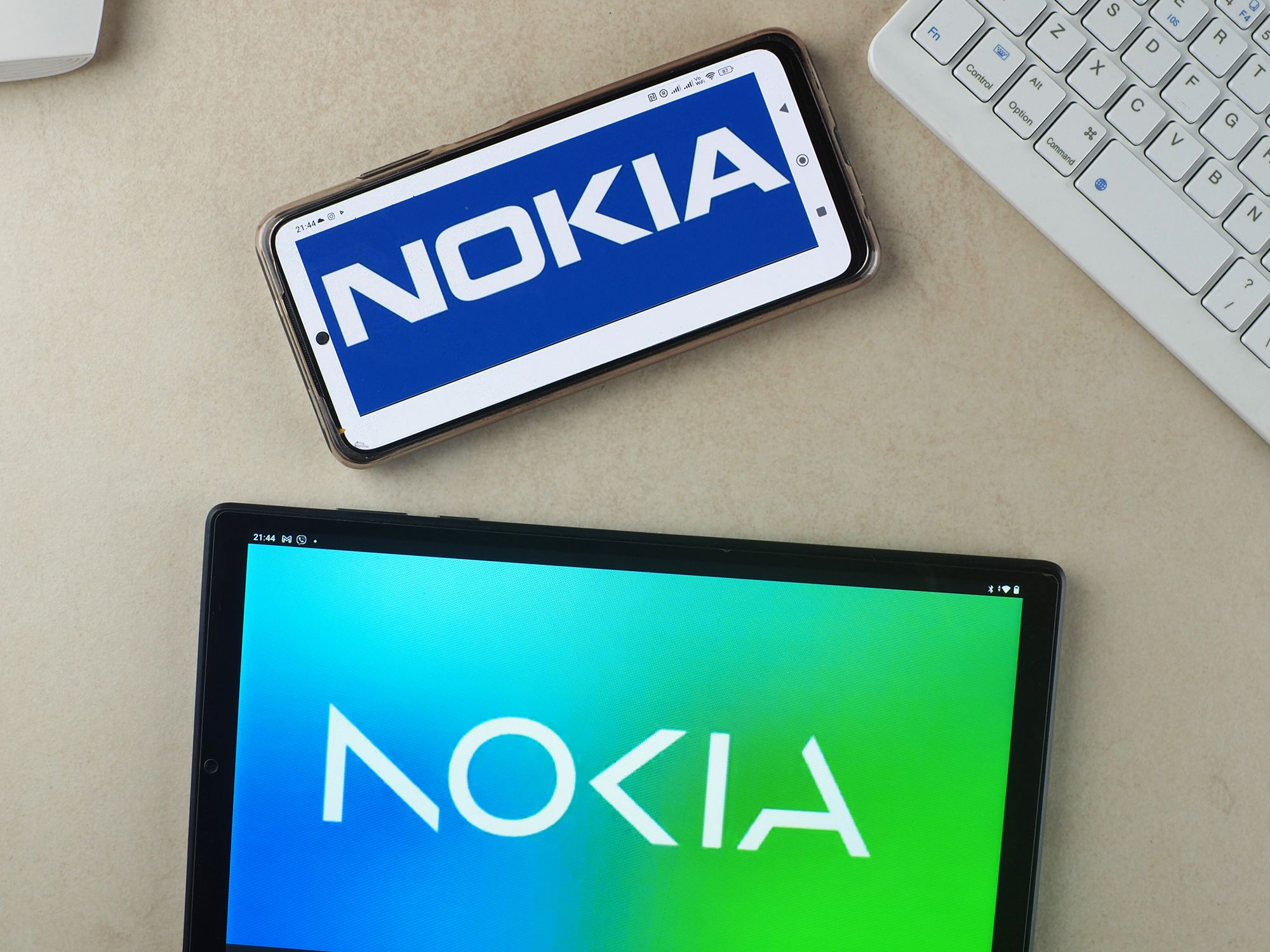
First introduced at the Mobile World Congress in Barcelona, Spain, the new logo revamps the old iconic logo for a more modernised and geometric design.
Lippincot, a branding and consulting firm who worked on the logo change, said that the logo was designed as such so that it reads as Nokia when the letters appear together.
Additionally, the logo's 'N', 'O', and 'K' letterforms are set to be used across all typography in the company's content, so all communication materials will feel 'distinctively Nokia'.
The reason for this change?
Well, it's because Nokia doesn't make phones anymore.
According to Creative Review, the logo change is aimed at shifting the perceptions of the public.
Many still see Nokia as a mobile phone company, but in reality, they are now a business-to-business (B2B) innovation and tech company.
To put it simply, instead of producing phones, the company now makes routers, network processors, and products for telecom infrastructure. This includes services related to the 5G network, as well as cloud services and solutions, as reported by Barron's.
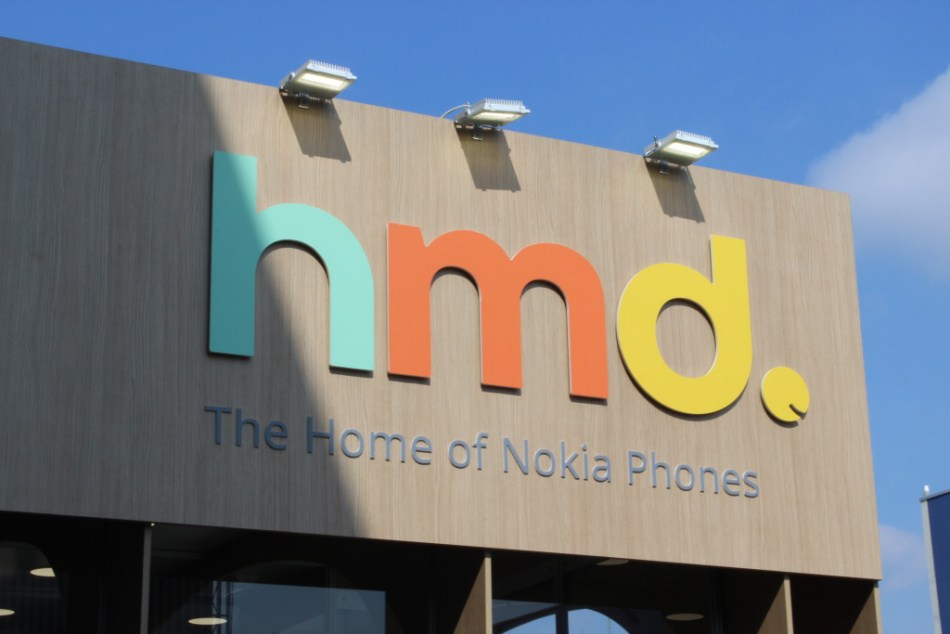
The mobile phone division of Nokia is currently owned by a Finnish mobile phone manufacturer called HMD Global
The mobile phone division of Nokia was initally sold to Microsoft in 2014, before it was bought out by HMD Global in 2016.
According to Gadgets 360, the company has exclusive rights to the Nokia brand for mobile phones through a licensing agreement. Additionally, the HMD Brand is used exclusively for corporate purposes, whereas the name Nokia Mobile is used in advertising and social media.


