WhatsApp Refreshes Its Design For A More Vibrant Look
Going green!
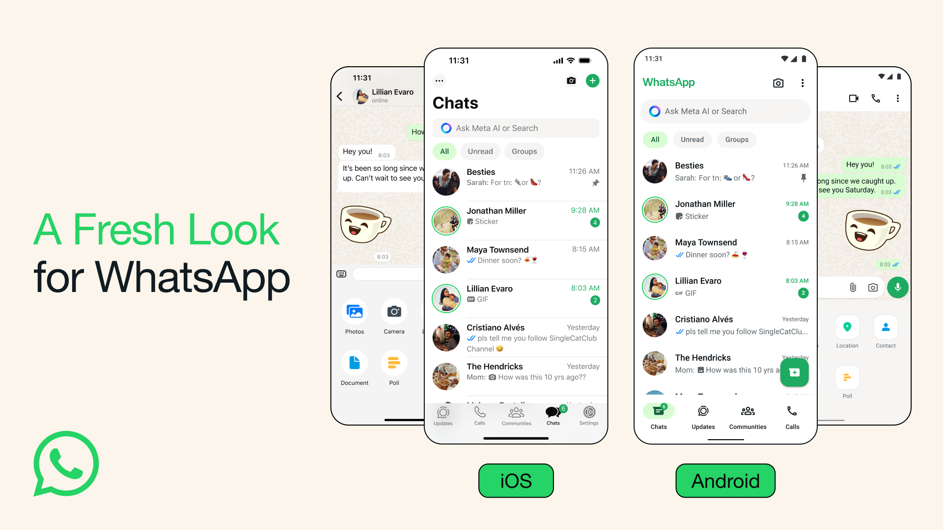
WhatsApp is introducing a new look, adding a fresh coat of green to the popular messaging app
If you were caught off guard by WhatsApp's new look, you're not alone.
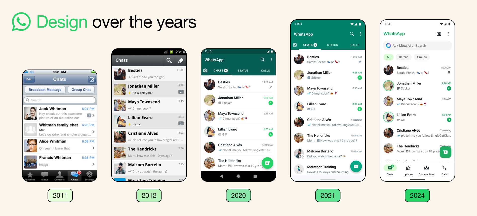
WhatsApp's recent visual overhaul marks one of the most significant changes the app has seen in quite some time. This update breathes new life into the interface, giving it a fresher and modern appearance.
This is a much-welcomed update, especially since the last major visual change was rolled out almost three years ago in 2021.
Green is the main theme in the newest visual update
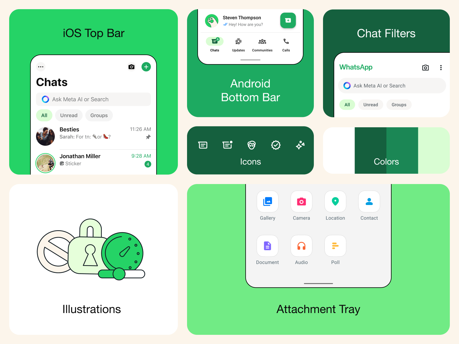
With the latest update, WhatsApp adopts green as its accent colour, visible in elements like notification badges and buttons. This change is particularly noticeable on Android, where the tab bar has been relocated to the bottom of the screen, aligning more closely with the iPhone version.
In response to user feedback, WhatsApp has revamped its Dark Mode to offer higher contrast and darker tones, aiming to reduce eye strain in low-light conditions. Icons and illustrations now sport a more rounded and contoured design.
The update also introduces new animations and chat wallpapers to further enhance the overall user experience.


