Here’s What The #VisitMalaysia2020 Logo Looks Like Compared To Logos From Previous Years
One thing for sure, there were no apes or penyus in sunglasses back then.
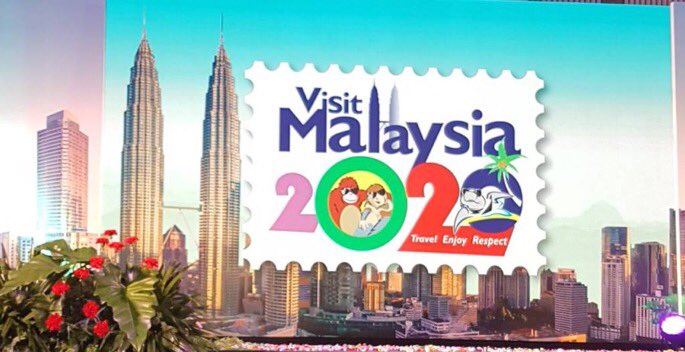
It hasn't been a good week for the newly-unveiled Visit Malaysia 2020 logo. With apes in shades and wacky fonts plastered over a stamp, the new logo has been widely criticised for its amateurish, cartoon-like design.
In addition to being the butt of a joke on social media, some Malaysians also pointed out how "ugly" the new logo looks especially when compared to the better designs from previous tourism campaigns
sorry to say, but that is one ugly logo. I'd rather have the 2014 logo being reused.
— Шaфик Aшpaф (@syfq_syrf) January 27, 2018
Visit Malaysia 2007 Logo, Malaysia Truly Asia Logo, and KL Sea Games last year are some of the good example of the better example of what Malaysia did in the past. Do have the concious to demand a better product. Lets all start making Malaysian proud with our own country. Please pic.twitter.com/09SwuRTrED
— Faiz Wan (@F41zWan) January 28, 2018
So, is the Visit Malaysia 2020 logo really that bad when compared to its predecessors? Let's take a look:
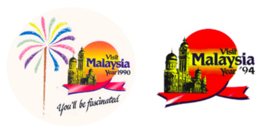
The Visit Malaysia Year (VMY) campaign was first launched in 1990 with a logo featuring the Sultan Abdul Samad building in Kuala Lumpur with the tagline "You'll be fascinated"
Following the campaign's huge success, with Malaysia charting 7.4 million tourist arrivals in 1990 compared to 4.8 million in 1989, Visit Malaysia Year was brought back in 1994 with a similar logo and theme ("Fascinating Malaysia. Naturally More.").
At the tail end of the '90s, Tourism Malaysia launched the massively successful "Malaysia, truly Asia" worldwide marketing campaign in 1999. Until today, the iconic jingle is still the first thing that comes to mind whenever tourism in Malaysia is mentioned.
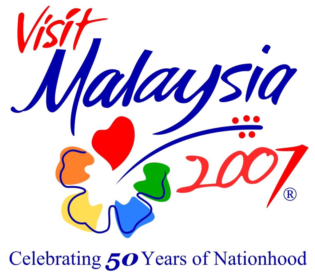
Visit Malaysia Year returned for its third iteration in 2007 in conjunction with the nation's 50th Independence Day, with a logo revolving around a hibiscus motif
To reflect the celebration of five whole decades of independence, the theme of VMY 2007 was "Celebrating 50 years of nationhood".
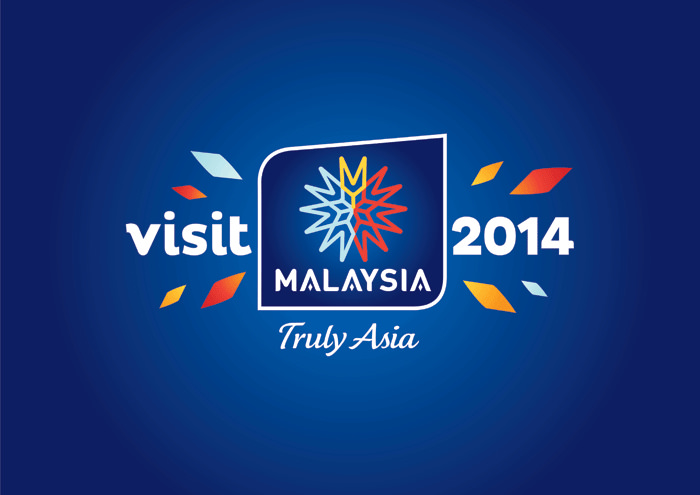
The logo for Visit Malaysia 2014 sported a cleaner and more modern look, this time featuring the timeless "Malaysia, Truly Asia" tagline
Fun Fact: Tourism Malaysia held a logo design and slogan competition in 2012 to aid selection for VMY 2014.
Some elements of the 2014 logo were later incorporated into the Year of Festivals campaign in 2015.
Remember the 'Cuti-Cuti Malaysia' jingle sung by local songbird Siti Nurhaliza? First launched in 2009, the domestic travel campaign has been revamped several times since then, though the logo has largely remained the same.
The latest iteration of the campaign, branded as 'Cuti-Cuti 1Malaysia Dekat Je', was launched in June 2015 to encourage Malaysians to prioritise local holiday destinations and to travel during off-peak seasons.
Now for a little bonus content - we also came across some pretty interesting designs for state-focused tourism campaigns. Terengganu actually had a cute penyu-inspired one in 2013:
The state brought back the turtle motif (sunglasses not included) and the 'Pesona Terengganu' theme for this year's logo.
The Sarawak Tourism Board also went with a logo inspired by the state emblem, the burung kenyalang (hornbill)
You guys, the Visit Kelantan 2016 logo is so nice. Check out that little wau and swirly waves!
The theme for the 2016 state tourism campaign was "Menyusuri Warisan".
In tandem with the tagline "World of Wonders", the Visit Perak 2017 campaign utilises shades of blue, green, and orange in overlapping silhouettes of the state's popular landmarks
True to its nickname 'Negeri Jelapang Padi', Visit Kedah 2008 and 2012 featured the same paddy motif
The Visit Pahang 2017 logo incorporates an elephant design and the word "hogoh", a colloquial term used by the people of Pahang to mean "go for it"
According to Vectorise, the word is believed to have been used by Pahang fans during football matches to spur on their team. It can also be used as a term to motivate and encourage.
Meanwhile, the elephant in the logo design symbolises the Asian Elephant, an indigenous species to Pahang, which is critically endangered with less than 1,200 roaming wild in Peninsula Malaysia.
We thought this Visit Selangor logo from 2015 was a joke. Turns out it's not...?
