Here's Your First Look At The New Maybank2u Website
Very, very nice.
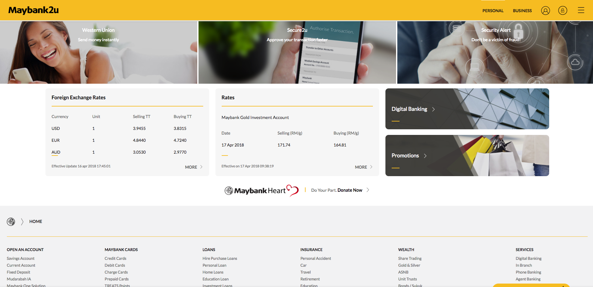
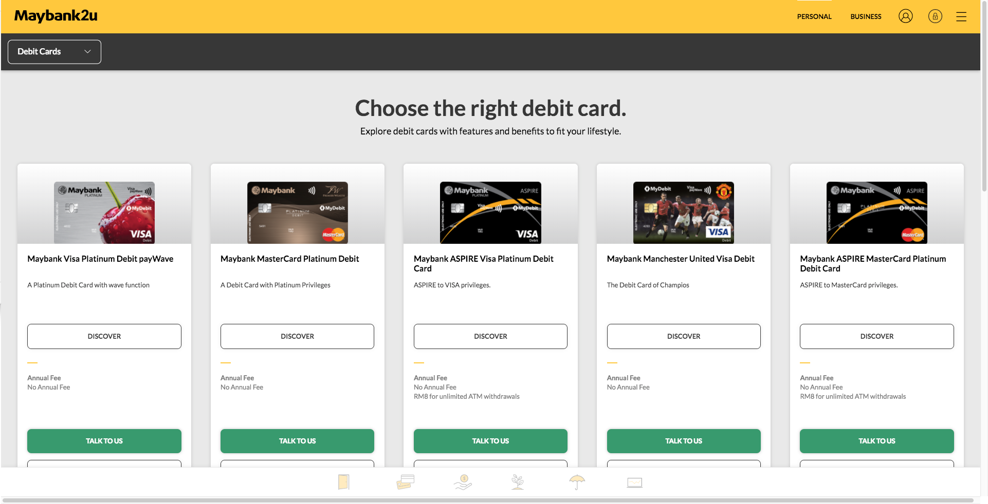
Maybank, the leading financial institution in the country, has just revealed its newly refurbished Maybank2u website in a special preview event today, 17 April
With simplicity and personalisation in mind, the new website comes with a complete change of user interface and offers users an enhanced experience when transacting.
The new Maybank2u website incorporates several first-of-its-kind features which provide users more convenience when conducting transactions online
It offers a display of remittance options when customers wish to transfer funds overseas. On top of that, the display provides transparency of the charges and foreign exchange rates as well as an indication of the times taken for transfer.
Customers can then make informed decisions on the most suitable option they prefer.
The website also provides an enchanced level of security as customers can opt to use their own pictures for the Security Image before logging into their account
In addition, the new site offers a 360 Dashboard which gives you a holistic view of your accounts and investments.
To be released in stages is a debit and credit card spending tracker to help users understand their expenditures better
There’s also a Goal Savings Plan which is a customised savings planner to help you plan and to achieve your goal by setting aside savings in different sub-accounts.
The new Maybank2u website will officially go live this Thursday, 19 April. In the meantime, you can check out the beta site here.


