
Meta Redesigns Instagram Logo For 1st Time In 10 Years & The Internet Is Confused
Is it just me, or does it read as 'Instagzam'?


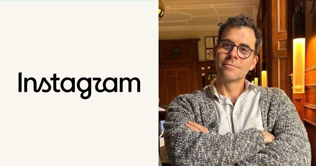 Cover image via
 Follow us on Instagram, TikTok, and WhatsApp for the latest stories and breaking news.
Instagram has updated its wordmark logo for the first time in a decade, but netizens are already poking fun at the new typography
In a post on the platform, Instagram head Adam Mosseri said the latest logo features a "cleaner and more modern" look.
"The wordmark at the top of the app hasn't changed in 10 years, so it was time for a refresh," he said in his post.
However, social media users immediately latched onto the new lettering, pointing out that the restyled cursive script looks suspiciously like 'Instagzam' or 'Instagwam'
"Design peeps are going to have a fun day tearing it apart. For what it's worth, I dig it. Fresh, modern, true to the original. Although some are saying it reads: Instagzam. I dig that," social media consultant Matt Navarra wrote in a post on X.
Bracing for the inevitable Internet reaction, Mosseri cross-posted the update to Threads, writing, "Thought I'd share this on Threads [too] and see what the hot takes might be."
Meanwhile, frustrated creators said Meta should prioritise fixing deleted accounts, bots, and AI content filters rather than tweaking logo fonts
"Adam, while Instagram gets a new look, thousands of legitimate creators and businesses are losing their accounts without clear explanations or real support," wrote popular account Resiliência Humana.
Despite the noisy online debate surrounding the new wordmark, the platform's multi-hued camera icon remains completely unchanged.
