Check Out These Old Logos & Ads Of Popular Establishments In Malaysia
A completely different era.

By Tamara Jayne — 18 Feb 2025, 05:26 PM
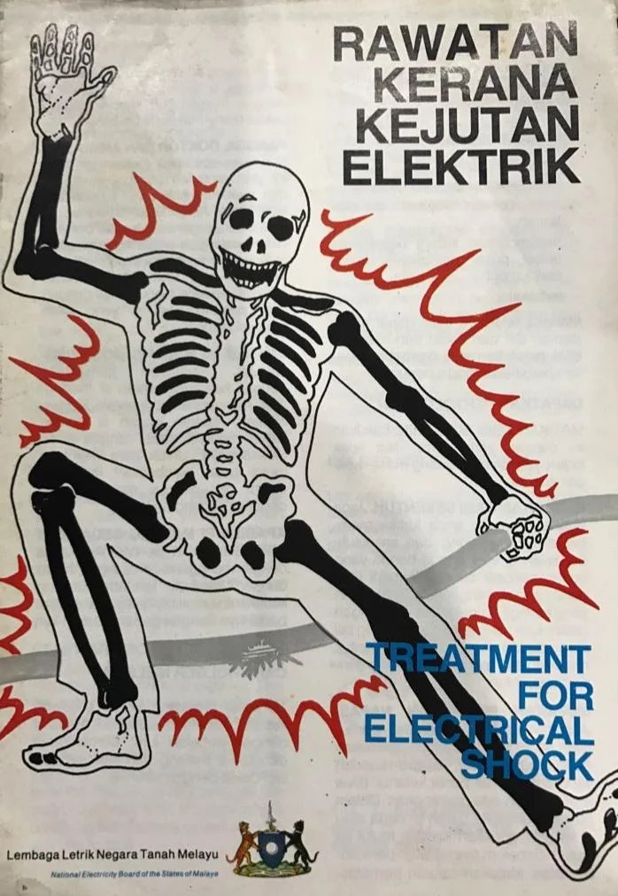
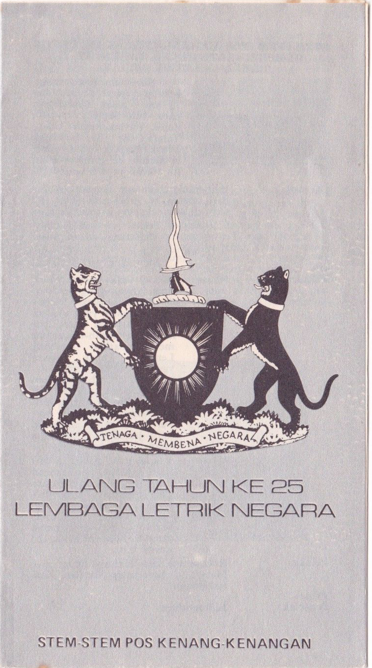
1. Lembaga Lektrik Negara (Tenaga Nasional)
Before it became Tenaga Nasional in 1990, Malaysia's electricity provider was known as Lembaga Lektrik Negara (LLN).
These early posters? Definitely retro vibes, right?
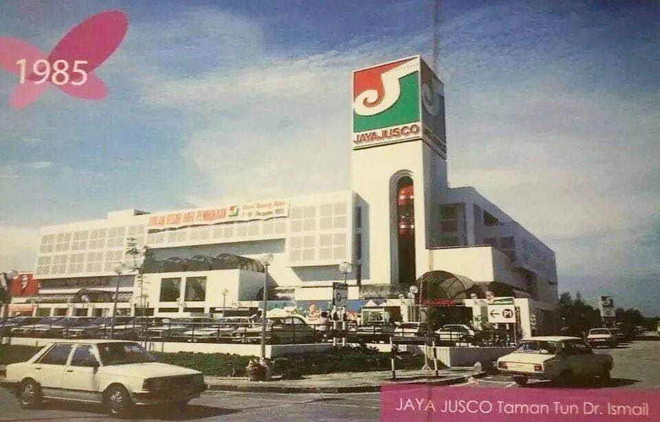
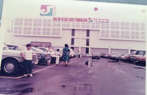
2. Jaya Jusco (AEON)
Jaya Jusco was established in Malaysia in 1984 to revolutionise Malaysian retail under then prime minister Dr Mahathir's vision.
By 2004, it evolved into AEON, but not before making its mark with the Dayabumi store and a second outlet in Taman Tun Dr Ismail, as well as many others.
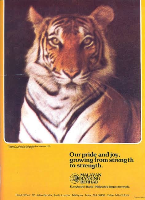
3. Malayan Banking Berhad (Maybank)
In 1977, Malayan Banking Berhad (now Maybank) used the charming Maywati, a tiger from the National Zoo, in its ad campaign. Cute!
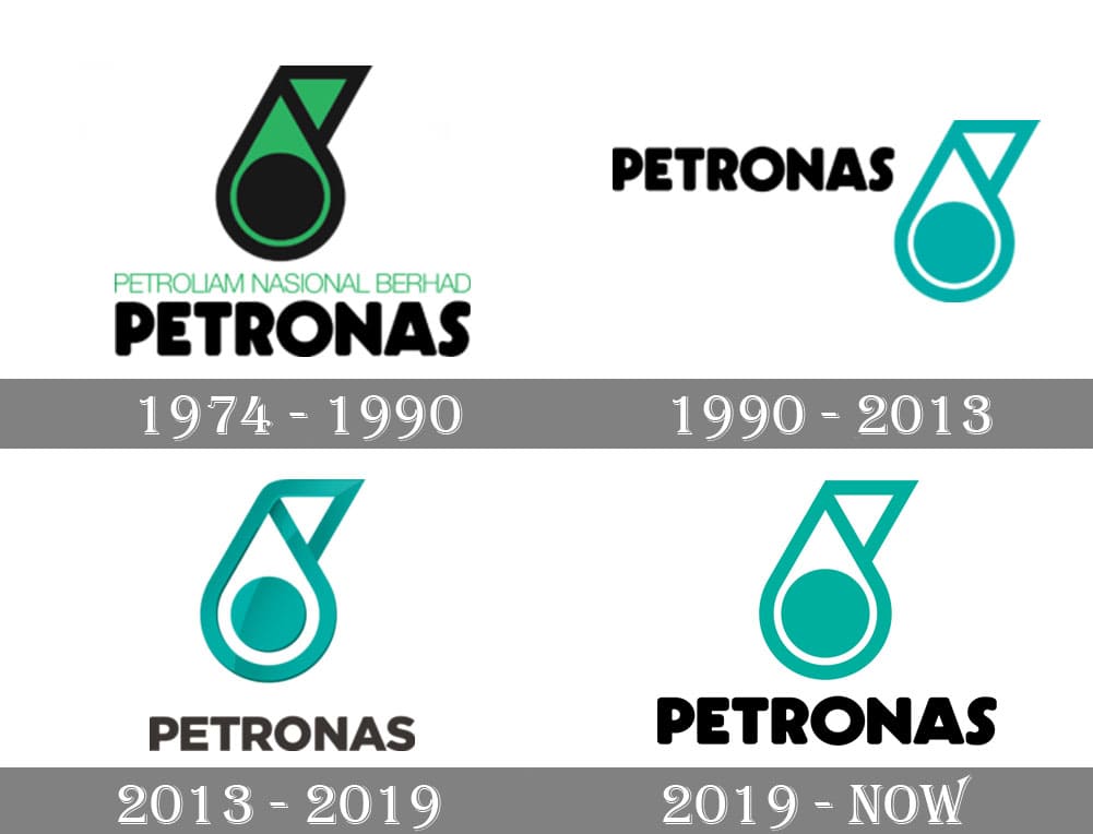
4. PETRONAS
The first PETRONAS logo, introduced in 1974, was emerald green, symbolising the land and seas that conceal oil and gas.
Over time, the logo's colours were replaced with teal, with only a few minor aesthetic tweaks here and there.
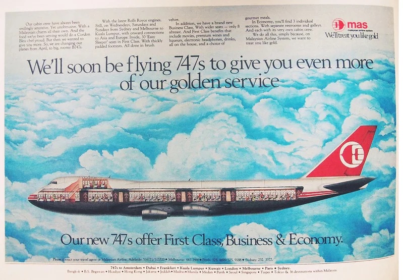
5. Malaysia Airlines
From the classic Wau Bulan in 1972 to the minimalist blue design in 2012, Malaysia Airlines has redefined its brand identity, returning to a version of its 1987 logo in 2021, which remains in use today.

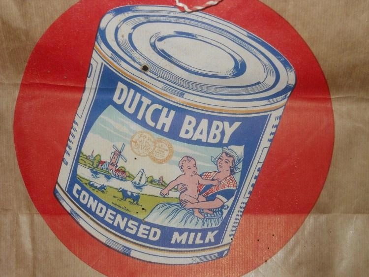
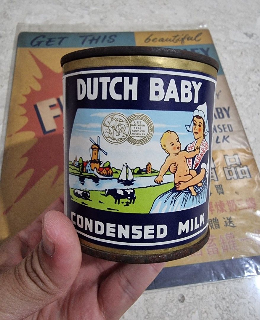
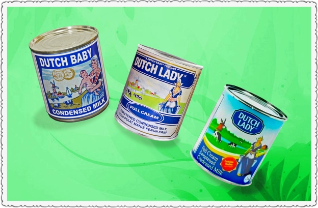
6. Dutch Lady
Dutch Baby rebranded in 1984 to expand beyond infant formula into a household dairy brand.
The logo evolved from a baby image to a Dutch girl in traditional attire, symbolising quality and heritage, before transitioning into a sleek blue swirl for a more modern and recognisable look.
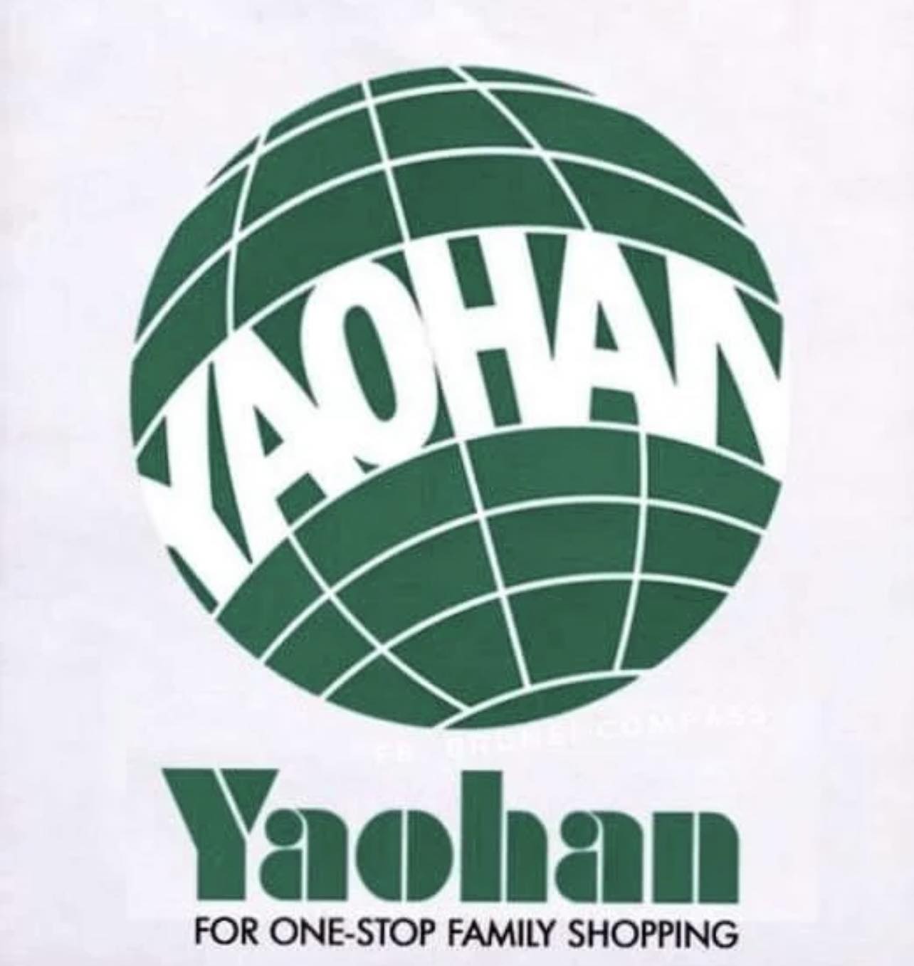
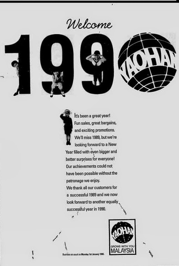
7. Yaohan
Yaohan, a Japanese retail chain that operated in Malaysia from the 1980s to the late 1990s, had a distinct logo that evolved subtly over the years.
Due to financial struggles and the Asian financial crisis, Yaohan Malaysia ceased operations in the late 1990s, following the bankruptcy of its Japanese parent company.
Its former locations were later taken over by other retail brands like The Store and AEON.
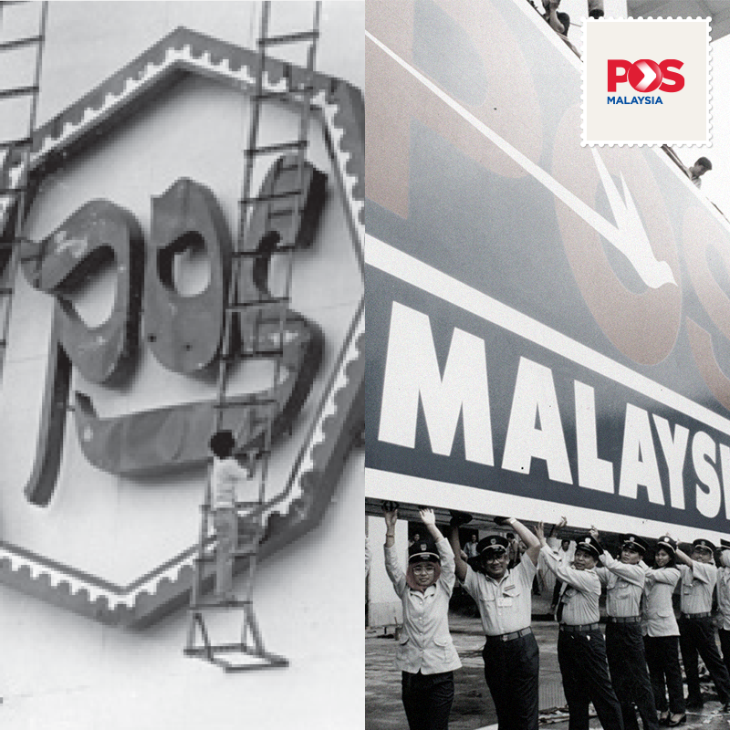
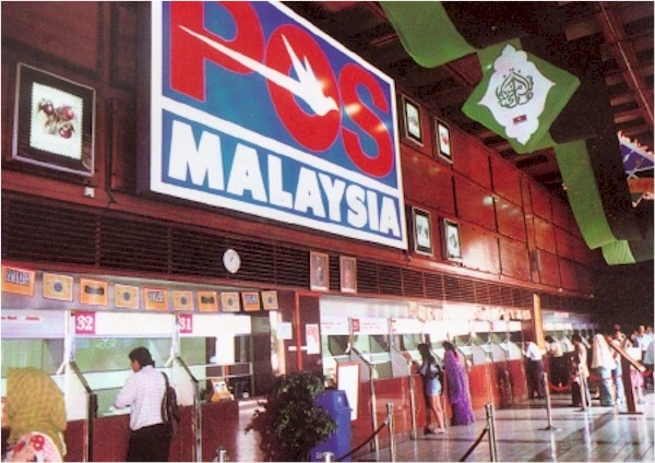
8. Pos Malaysia
Pos Malaysia's earlier logos featured a red and blue design with a postal horn, symbolising communication and reliability. In the 1980s, a red merpati (dove) logo was introduced to represent speed and nationwide connectivity.
As the company modernised, the bird logo was replaced with a streamlined "POS" wordmark with an embedded arrow, reflecting its shift to digital-era logistics. The latest redesign keeps the red colour while emphasising speed, efficiency, and e-commerce growth.
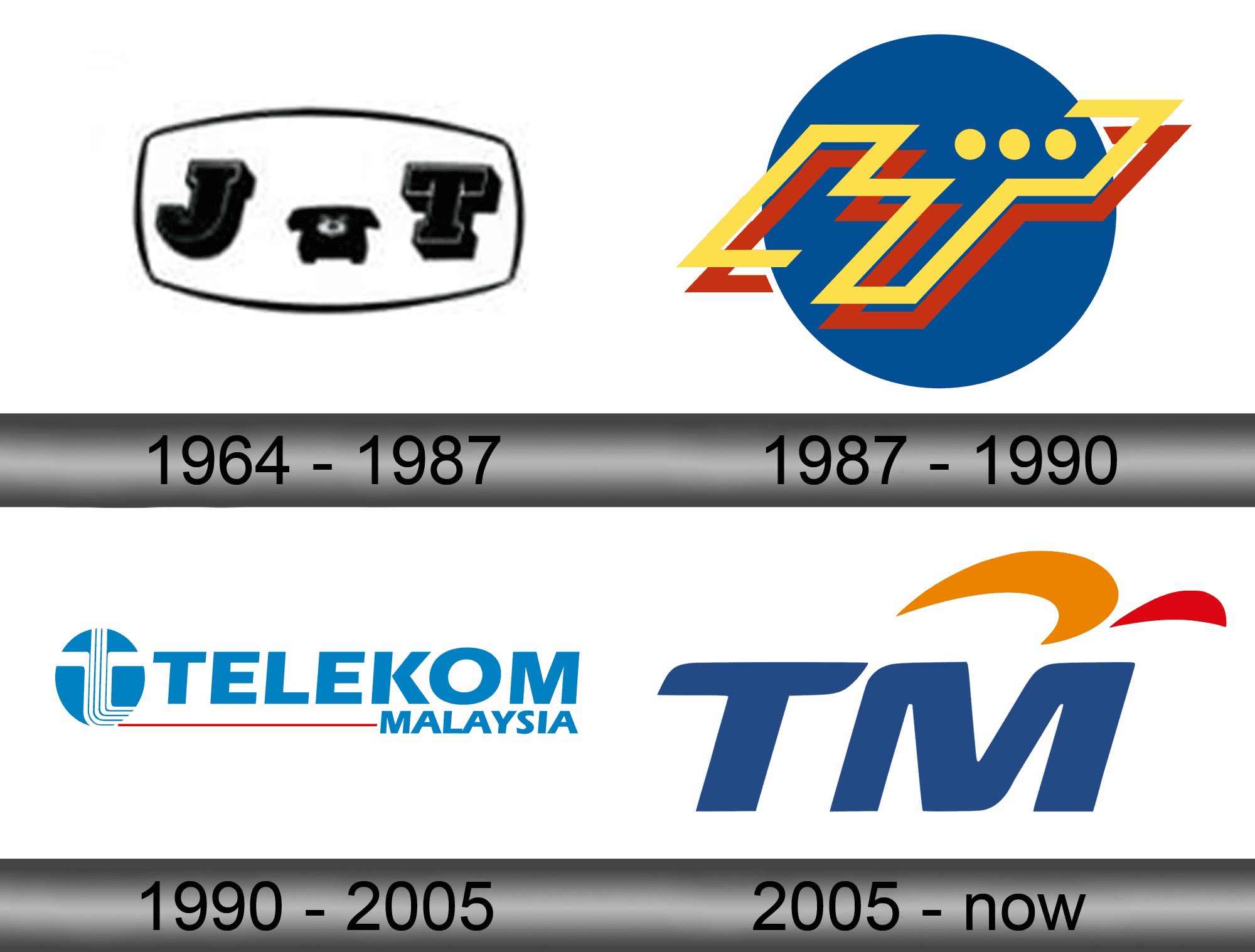
9. Telekom Malaysia
Telekom Malaysia's logo has undergone several transformations. It started in 1964 with a design featuring thick, black letters representing "Jabatan Telekom" (Department of Telecommunications).
In 1987, the logo was simplified to a blue circle with yellow and red lines.
In 1990, it became more modern, with five cables signifying connectivity. In 2005, the company shifted to the current "TM" wordmark, with added orange and red elements, representing the Malaysian flag, symbolising the brand's innovation and national identity.
10. Digi
The days of prepaid top-up cards, limited characters per text, and those unforgettable ads! How times have changed.
"I will follow youuuuuu..."

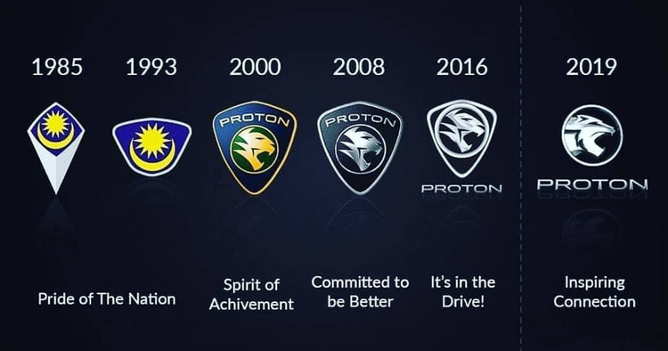
12. Proton
Proton's logo has definitely undergone quite a significant transformation over the years!
The early Proton logo featured a sun and moon symbol, representing the harmonious balance between tradition and innovation. It was designed to convey the idea of progress and unity, drawing on the cultural significance of these celestial elements.
Over time, Proton's logo evolved into a more minimalist and modern design, featuring a prominent tiger, symbolising strength and precision.
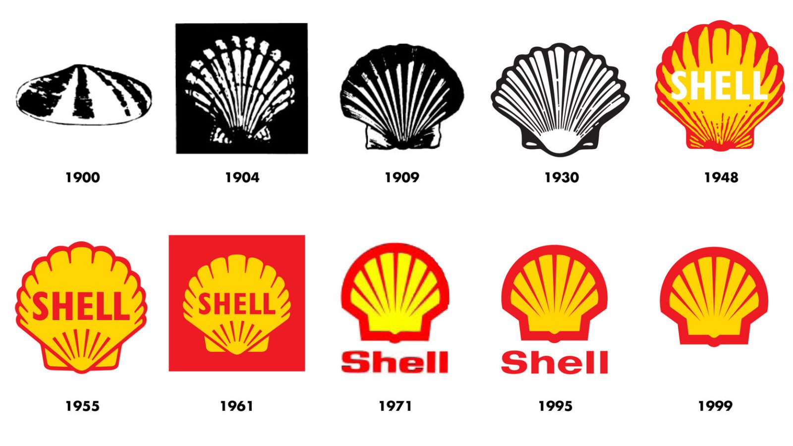
13. Shell
From the simple monochrome shell in 1900 to the iconic yellow and red colour scheme introduced in 1948, Shell's logo has remained largely unchanged since its redesign in 1971, making it one of the world's most recognisable brands.